“A lot of brands, you can’t touch them. When you’re dealing with Snoop Dogg, he brings you closer to the brand and it feels like it’s a part of you.”
– Snoop Dogg
Do you know why your company exists?
According to Simon Sinek, you’re doing it backwards if you’ve started with the “what” and moved right along to the “how.” The most successful businesses and people start with “why.”
Gaining loyal customers or community members and, eventually, advocates, is all about sharing fundamental beliefs. Once you can articulate those core values, you can begin to consider what to create and how to tell people about it.
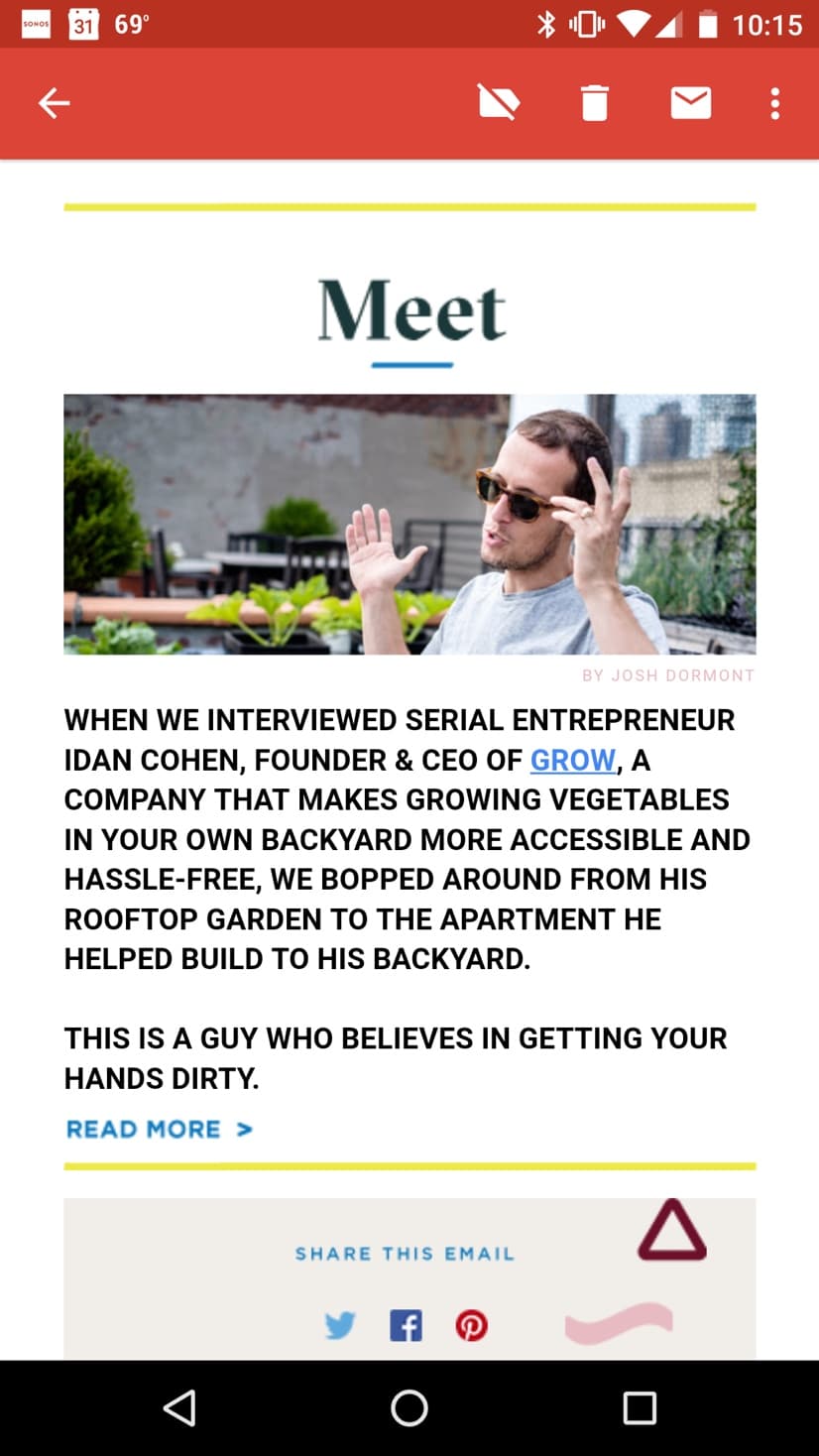
We spent years dreaming of what would eventually become Arq. We didn’t have a name, a product, or a business model at first.
We began with a crystal clear mission: to help anyone connect with Judaism in a relevant, inclusive, and convenient way.
Once we could articulate why our company existed, we began to explore the form it could take – a website? a newsletter? an event series? – and how we’d share our mission with likeminded folks.
Branding is only a dirty word when it’s empty or inauthentic.
At its best, a brand is clear, unique, and meaningful. It responds genuinely to your customers’ or community members’ deepest emotions and desires. It helps people understand why you do what you do and how your product or experience is distinct from others. It is the filter through which you pass the most important decisions of your company.
For instance, one of Arq’s personality attributes is optimism, so we always speak in positive language and avoid a snarky or sarcastic tone. A brand can be a guiding light for its products, too. One of Arq’s core values is inclusivity, so we knew from the get-go that having an online presence would be a central priority, since anyone from anywhere can access our website, whereas local events exclude a large portion of our community.
Building a brand is HARD work. It requires your head and your heart. You must be intentional, honest, and committed to create an enduring, strong brand.
Here, we share the step-by-step process we followed to articulate and visualize Arq’s brand.
Discovery
I. Research
As we mentioned in our post about the process we used to name Arq, we found the Brand Strategy Canvas to be a very, very helpful resource and starting point.
The Brand Strategy Canvas is a template that asks you to answer deep questions about the customer or community that you’re creating for and your company or organization’s offerings and benefits, core values, and competition. The tool helps you to piece together a brand positioning statement word for word and to specify your brand’s personality and key messages.
We filled out the Brand Strategy Canvas on our own, then we turned to the professionals to bring our brand to life visually. We knew we’d need help making Arq’s brand tangible through a logo, color palette, website, email templates, and other visual assets.
We researched branding and design partners whose aesthetic was elevated, yet whose vibe was humble and true. We looked for a team that believed in our “why” and was excited about bringing it to life. By the time we hired the kind and talented SDCO Partners, we had already taken a first stab at Arq’s brand guidelines, so we began our engagement with a strong foundation.
To build off of our initial work, the SDCO team asked us questions like:
– Describe your business in one sentence.
– Is there a story that’s unique to your company?
– What are your plans and goals for your identity in the next year? Next five years? Could your business offerings change?
– Who are your competitors? How are they better/worse than your product/service? Who is your current target audience?
– What feeling or message do you want your brand to convey to those who view it? What do you want your brand to say about you?
– Describe your target client. (What are his/her interests? What do they read? What music do they listen to? Are they urban or suburban? What is their style?)
– At what price point will you provide your services?
– How do you plan on marketing your services?
These questions were relatively easy for us to answer, having spent so much time on the Brand Strategy Canvas and naming Arq prior to starting our work with SDCO Partners. However, their questions provided a welcome opportunity for us to practice clearly and consistently stating our brand values and commitments.
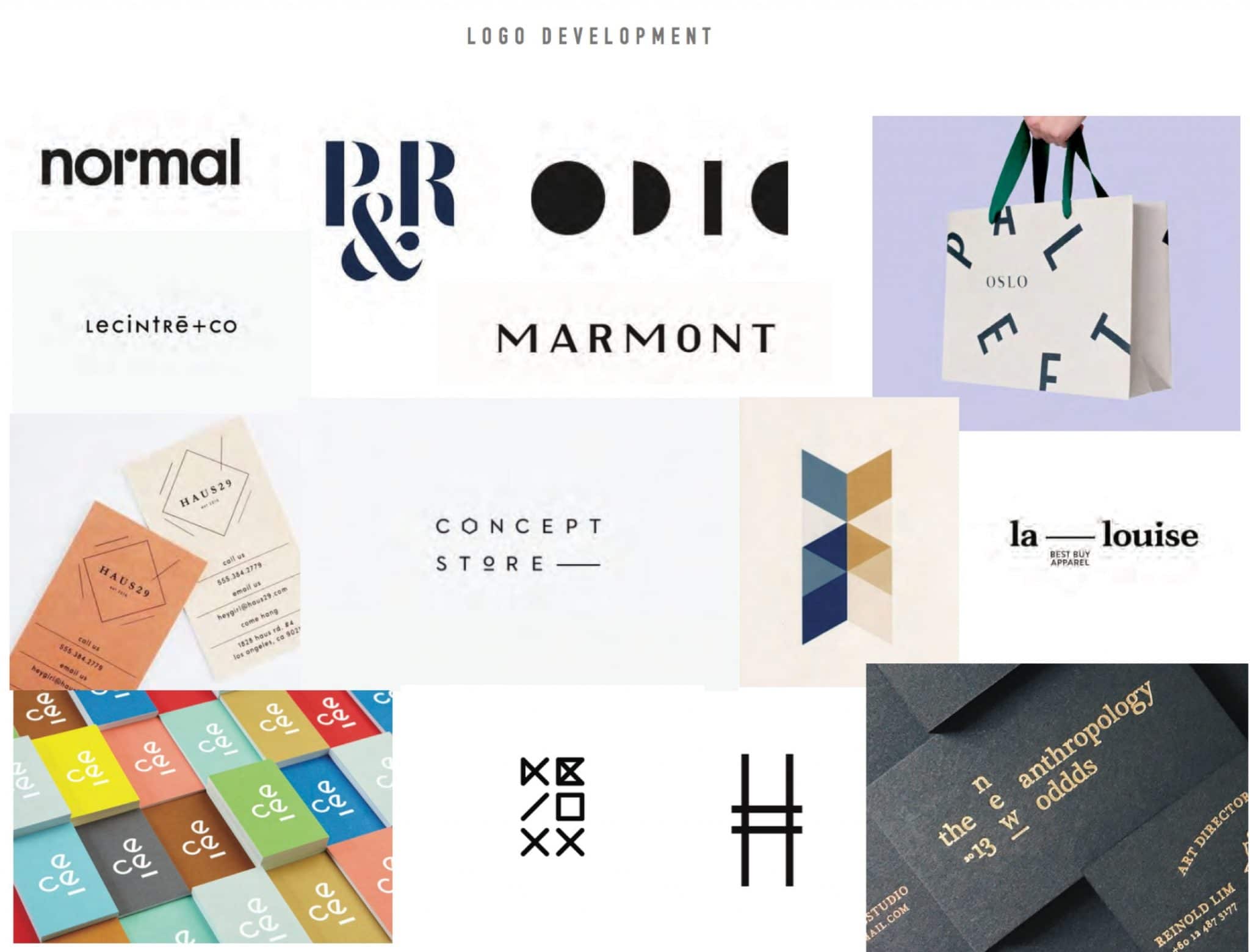
II. Inspiration
Once SDCO picked our brains, they got to work on translating Arq’s values and mission into a visual identity.
They created a brand board with a custom mix of images that served as inspiration for our logo, website, and other potential applications of our brand, like business cards. We gave detailed feedback about what we liked and didn’t, what was missing and what to double down on.
For instance, since Arq is focused on relevance and inclusivity, we liked the aspirational and aesthetically elevated visuals that SDCO selected, but we asked them to stay away from highbrow, exclusive, overly serious design. The more eclectic and non-one-dimensional the brand, the better, to represent the diversity of ways we believe there are to connect to Judaism.
The Style Guide
Logo
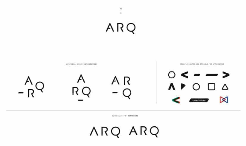
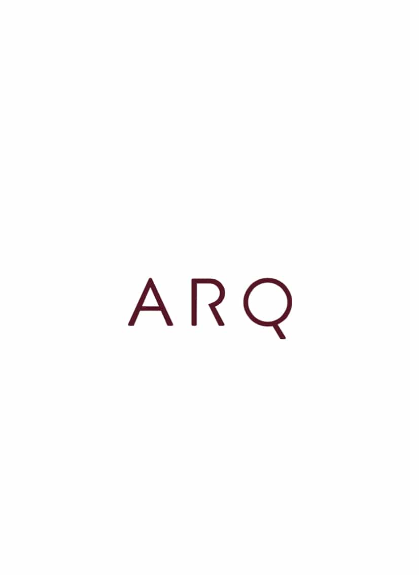
We went through a few rounds of revisions before we landed on our final logo.
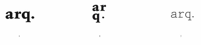
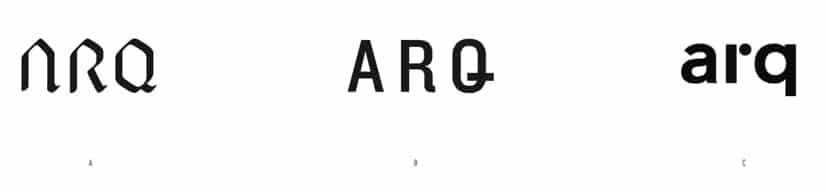
From the beginning, we liked the look of a bold and strong all caps mark and encouraged SDCO to continue to play around with the placement of the letters in our name. Anything that felt too abstract, old school, or theme-y didn’t pass muster.
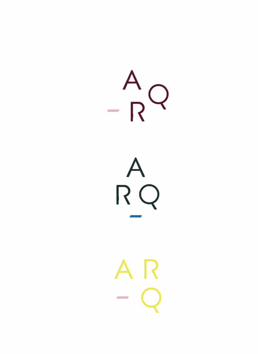
Here’s a look at some of the initial logo options.
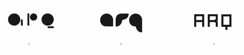
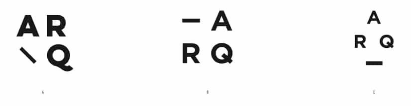
After a few rounds of feedback and revision, we landed on a our final options.
We wanted the primary mark to represent Arq’s name spelled out horizontally, but we loved the geometry of the secondary mark options where Arq’s name was turned into a shape. We loved the use of lots of bold color, but the red and green looked too Christmas-y to us. The primary colors felt a bit childish and can also be limiting when you start to combine and overlap them, which we intended to do.
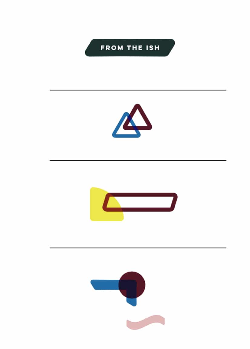
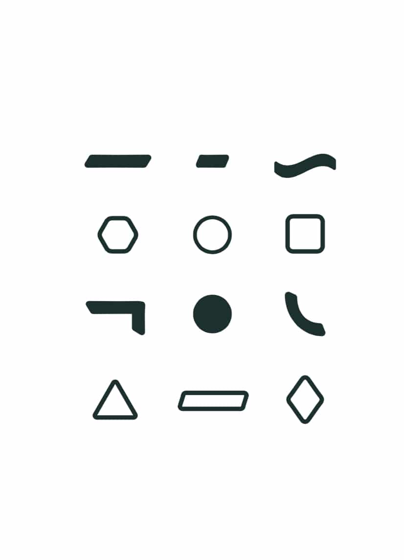
The graphic elements were exciting, but we asked SDCO to work with us to ensure they had intentional symbolism and weren’t just arbitrary, modern shapes that simply looked cool.
Brand Family and Colors
Our work culminated in the creation of our brand family and color palette, as well as our fonts.
SDCO totally got it when we said we wanted a “clashy / matchy ” look for Arq. One of the co-founders of the firm had recently seen artist Margaret Nomentana‘s work in Belfast, Maine at Chase’s Daily and thoughtfully referenced it for Arq’s vibrant, energetic, unexpected color palette.
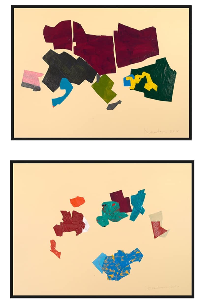
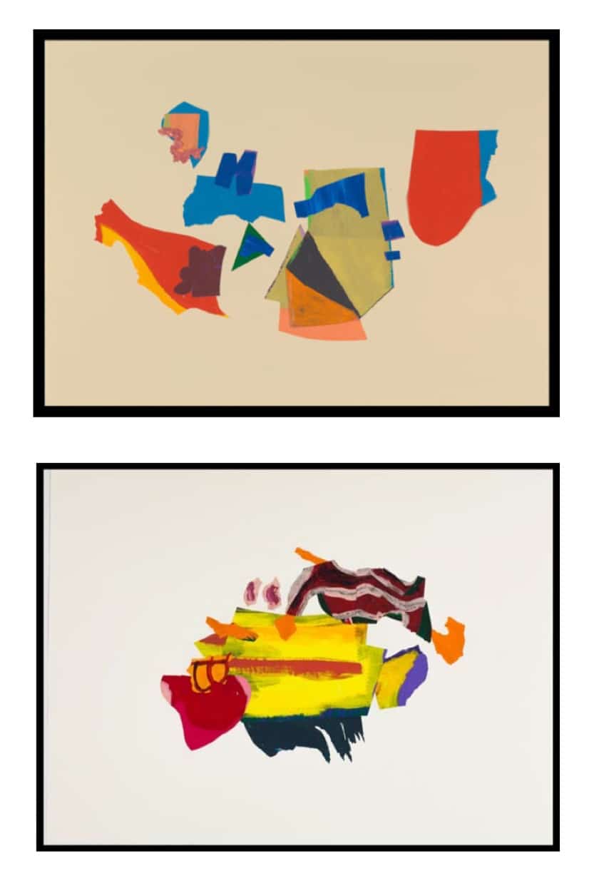
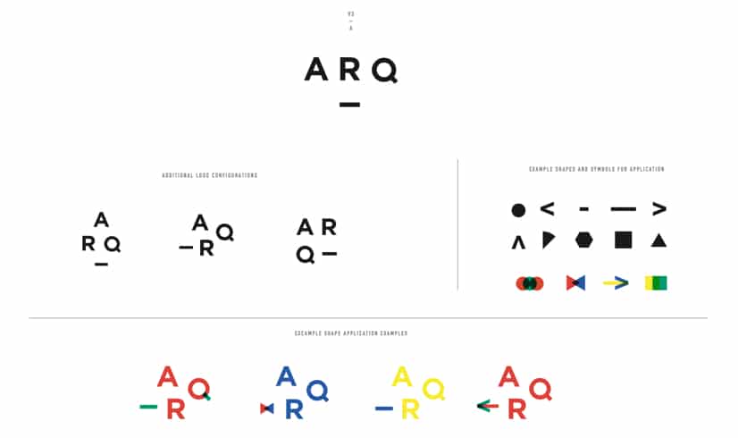
The graphic elements that we landed on include lines and dashes, which symbolize forward motion, evolution, and modernity, which align with Arq’s aim to help anyone connect with Judaism in a current way. The layering and stacking of geometric shapes reflect Arq’s connection to the basic building blocks of an ancient religion and culture and also how we are remixing and modifying those fundamentals for today.
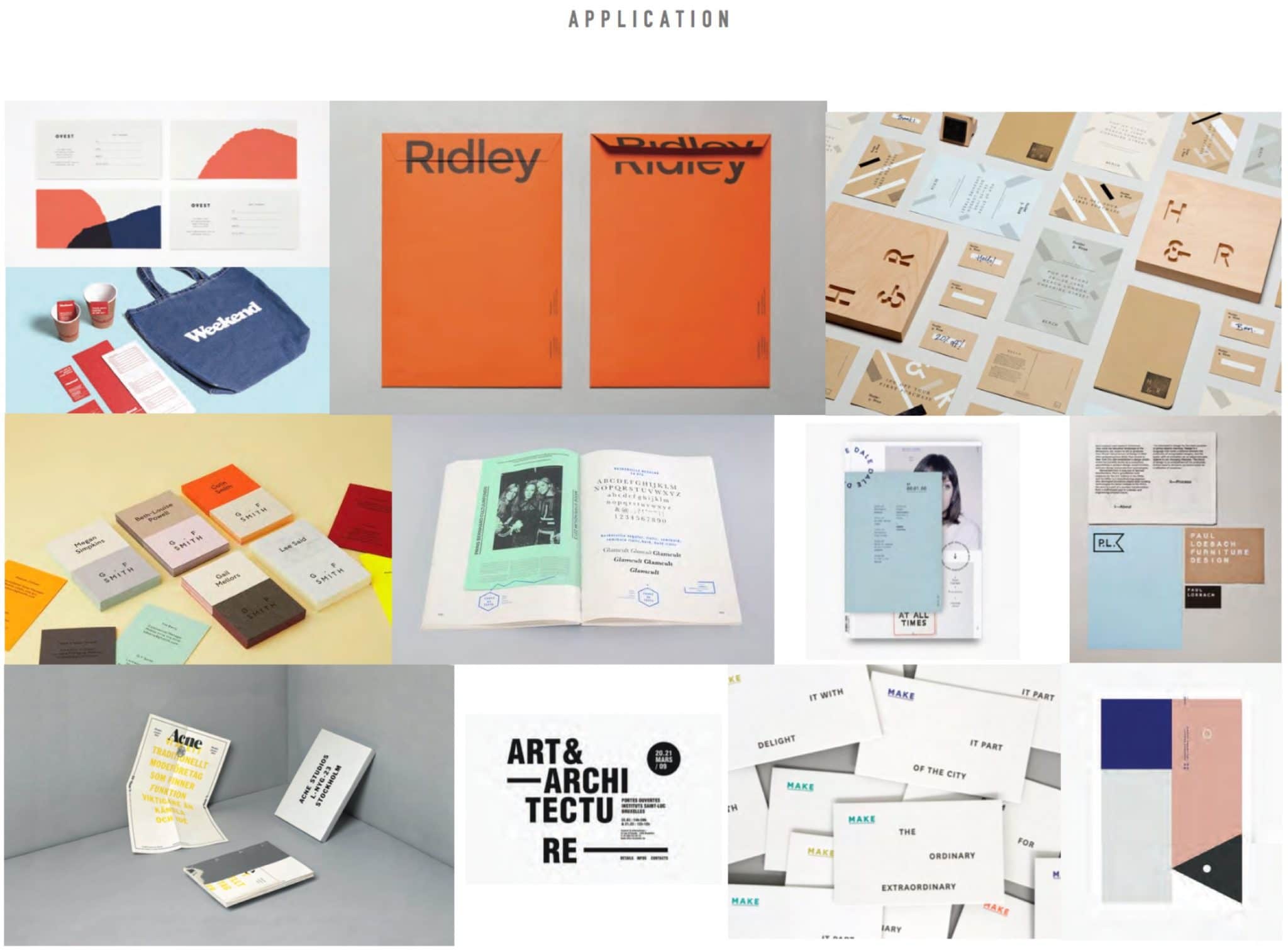
IRL
The very first brand applications that we created were our website and the templates for our emails.
Before kicking off our website design and development process with SDCO Partners, we answered a questionnaire with questions like:
– Who is your intended audience? Are they regional, industry-specific, etc.?
– What are your website expectations, main emphasis and primary goals – increased sales, increased leads, etc.?
– Please provide examples of websites you like and don’t like. Why do you like or dislike these sites?
We secured our domain, our social media handles, and an EMS (email marketing service, e.g., MailChimp). After a few rounds of wireframes and designs, we got access to our test site, played around and made final notes about bugs, then we went live!
PRO TIP: It always, always, always takes longer than you think it will to launch a website. Things inevitably get screwy when you go from wireframe to design to test site to live site, and, each time, bugs are discovered, and changes get made.
OTHER PRO TIP: Given the tip above – do not, do not, do not make your website live on the day you plan to announce it exists! Give yourself at least a day or two to play around on the live site to make sure everything’s working smoothly and to give a select group of folks the chance to beta test it and provide feedback. Also, work closely with your designers and developers on this timeline so that you know they’re available to make changes when you need.
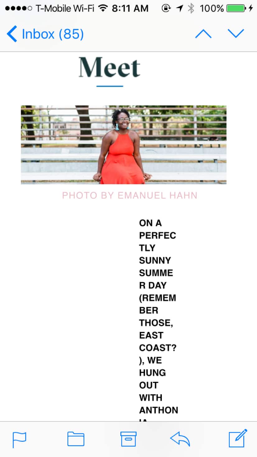
Our email templates are an ever-evolving project, as is the application of our brand in our social media. Visually, our email templates are consistent with the rest of our brand and its applications online, but their structure and function changes in little ways as we learn what works best for our content and our community.
For example, thanks to helpful feedback from our community, we learned that the original email template for our weekly digest of all things Jew-ish, The Ish, wasn’t entirely mobile friendly. One third of the people who read The Ish every week read it on their phones, so we made quick updates to its font size and layout to improve its readability.
Our startup budget hasn’t allowed for business cards or stationery…yet, but we love gifting Arq stickers to anyone who will proudly display them on a notebook, laptop, or phone! If you’ve made it this far down in the article, send us an email at hey@thisisarq.com with your name and address and we’ll send you some swag 🙂
Have a question about our branding process? Email us at hey@thisisarq.com or click here to tweet at us!
YOU MIGHT ALSO LIKE THIS: If you found this article helpful, you might also like the post “Create The Best Brand Name” where we share the process we used to name Arq.
Photo by Elena Mudd. Designs by SDCO Partners.
Thank you for visiting Arq!
Arq is no longer publishing new content. We hope you'll enjoy our archived posts.